• portfolio
  • SERVICES
  • ABOUT
  • Blog
  • contact

RICHARD MANVILLE STUDIO

  • DESIGN
  • CONSULTATION
  • PHOTOGRAPHY

Leaving a Marc

August 10, 2016


I’ve worked on a number of projects with Marc Friedland Couture Communications and most recently completed creation of advertisments for Marc’s business. He is well known for high-end, over-the-top invitations and event designs for celebrity clients.

Naturally, I wanted the ads to embody the scope of what they stand for and not just a pretty shot of paper invitations. I outlined the creative goals of the project:

Position: MFCC is not just selling invitations. MFCC is selling dreams. Moments of fun, anticipation, romance, and glamour.

Demonstrable Messages: The act of giving and receiving an invitation is a glamorous act. The right invitation embodies the essence of your event and, more importantly, you.

Before I had even started on concepts, Marc had selected the model. The model was Morganne, a very talented chanteuse (and also a Gemini) with a unique style of her own. Her vintage persona had the right glamorous tone and lead me to working in one of my favorite genres, high fashion 50’s.

The amazing photographer, Lara Porzak, and I both gravitated toward Lillian Bassman (shown below) as inspiration for the photographic style.

I then created about 6 different concepts that would work with all the various creative choices and limitations. Shown above are a few of my concept pages for the “special delivery” bird idea including inspiration and sketches. It was this concept that I had hoped would be chosen but initially wasn’t so well received.

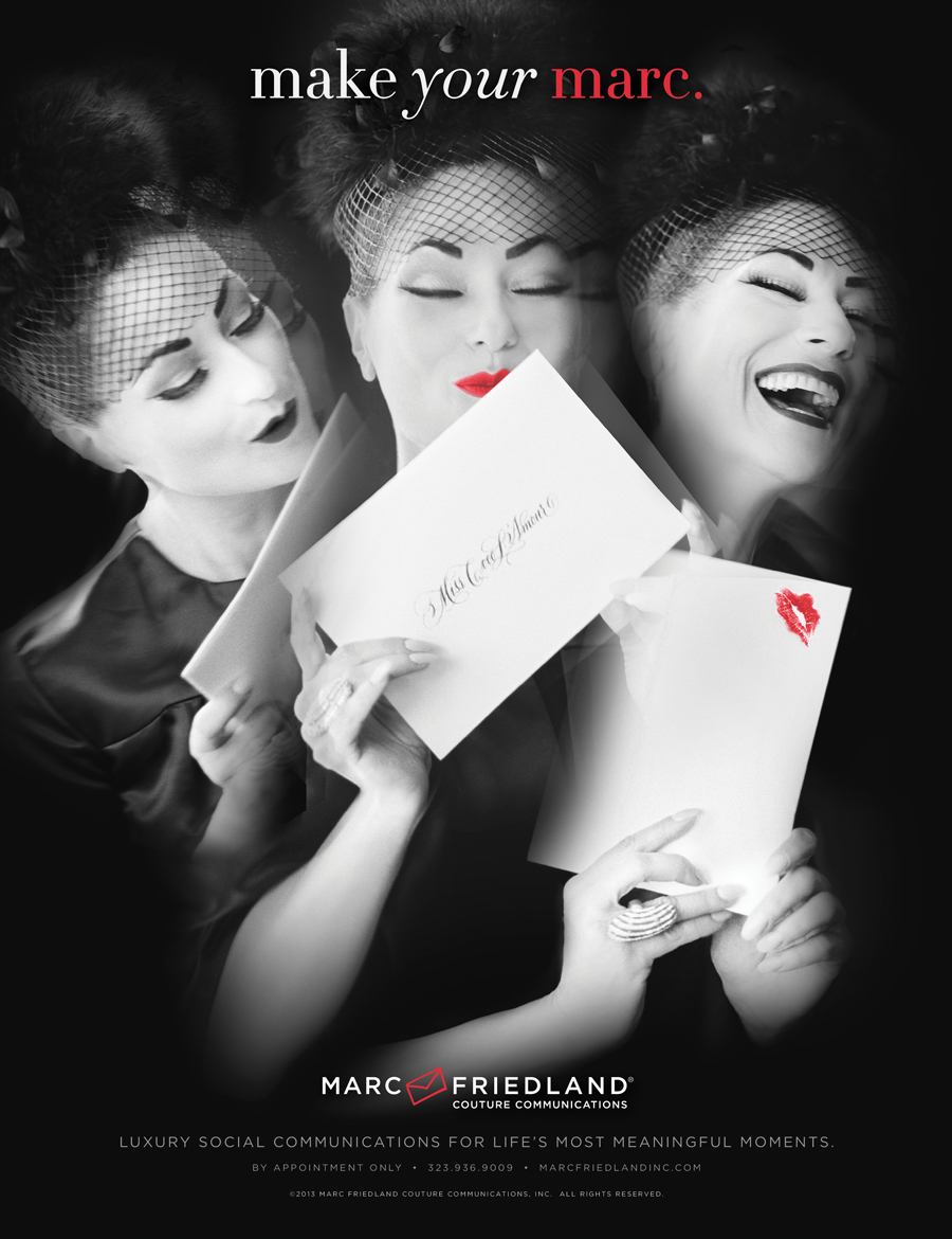
Marc decided that he wanted to stick with two headlines that he had used previously, “Make Your Marc” and/or “Marc the Moment”. This narrowed the concept choices down. The Envelope Kiss concept (final ad shown bottom) fit with the headline, was well received, and as the primary choice, we focused the photo shoot around it.

Lara shot with film (which is now a rarity) and only using natural light. Chasing natural light, it was a whirlwind shoot, for about half a day. After I got all the necessary shots for the “kiss” concept we quickly squeezed in shots for the other concepts including the bird idea.

The following week, with hundreds of amazing photographs from Lara, I started scanning, retouching and composing the final ad concept. I went ahead and created the bird concept shown at top, primarily for me, and shared it with Marc. He ended up loving it and it ran also.

The ads ran in C Magazine, Los Angeles Magazine, and Hollywood Reporter.

 mfad1_HReporter_MAKEYOURMARC_FINAL1


Share

Facebook Google+ Twitter Pinterest Email

Swatch Out

August 2, 2016

In the process of designing a young ladies’ bedroom, I created a couple prints to be used throughout the room. The featured swatch didn’t make the cut but, of course, I still love it. I also love what we did use in the project. I extracted parts of the original to create the new print. This was printed on a linen-cotton canvas and used for window treatments and pillows. Shown below are some pillows created for the project that shows a different use of the same print.

SWATCH_BW_MEDALIONS_PATTERN

3pillows

custom pillows


Share

Facebook Google+ Twitter Pinterest Email

Cloud thoughts

July 20, 2016

This is an image I created as a personal poster project that features my niece who generously (and somewhat reluctantly) posed for me.

Share

Facebook Google+ Twitter Pinterest Email

Westfield Icons

May 6, 2016


Another project with Axiom was for their client Westfield. The Westfield Group is a retail property group (world’s largest) operating 119 shopping centres in Australia, New Zealand, the United Kingdom and the United States. They buy aging/failing mall properties and overhaul them. They do this exceptionally well, from my own consumer point of view, so I was excited to work on the project.

The first project was to refresh Westfields trade environment (booth) at their retail properties show in Las Vegas. The trade booth was very corporate and didn’t really feel like their properties which are warmer, modern/fashion-forward, and inviting. The change was to be primarily a surface change and not a total rebuilding.

I generated a few overview concepts featuring new palettes, illustration styles, graphics, display techniques and finishes that were applied to elevations from their existing trade booth. The overall palette shifted back to focus on their primary corporate colors (red and grey) to ensure they would have instant brand recognition at the show.

Once the project moved to the development and production team, I focused on creating artwork that would be applied to the concept. One such project (the feature of this post) was a wall that featured a map of the world that highlighted Westfield’s global property locations. I developed the map starting with a series of icons (shown) I illustrated to describe the many features of a Westfield property ie; shopping, dining, etc. The icons would then form the continents of the map (shown).


Share

Facebook Google+ Twitter Pinterest Email

CARTOON NETWORK HANNA-BARBERA

February 29, 2016


Share

Facebook Google+ Twitter Pinterest Email

Separate but equal

January 31, 2016

In the late 90’s, WarnerBros. hired Landor & Associates to attempt merging two mega-brands (Superman and Batman) with the WarnerBros. name. Landor was unsuccessful in presenting an option that was acceptable. However, to be fair, the whole exercise was perhaps not the best idea to begin with.

At the time, I had just joined WarnerBros. consumer products through the merger of Turner Broadcasting and TimeWarner. As the new design director, with the most branding experience, the project landed on my desk.

My intent was to do as little damage as possible to the individual brands. The pages below were from my exploration. Ultimately, the wedge “trade dress” concept was not adopted but the logos were applied to all Batman and Superman branded products.


Presentation of brand merging exploration


Share

Facebook Google+ Twitter Pinterest Email

Scooby-Doo!

January 31, 2016

Scooby-Doo Style Guide


Branding and packaging guidelines


hangtags and woven labels


Scooby-Doo and Barbie Co-branding


Share

Facebook Google+ Twitter Pinterest Email

A Classier Wabbit

January 31, 2016


Mass Market Logo


Mid-Tier/ Upstairs Logo


Branding Guidlines


Share

Facebook Google+ Twitter Pinterest Email

Felix The Magical Cat

January 31, 2016

New Brand Logo


Logo Variations


Branded Packaging


Stationery Branding


Branded Wrapping Paper


Product Design: Notebook/journals

Product Design: Notecards


Product Design: Wrapping Paper


Share

Facebook Google+ Twitter Pinterest Email
  • Newer
  • 1
  • 2
  • 3
  • 4
  • Older

About the studio

Richard Manville Studio is a Creative Branding Consultancy working with clients on brand development, through a blend of creative and strategic vision. Across our range of capabilities from brand work to product, package design, and photography, we explore the best ways to creatively maximize your business.

connect

  • Instagram
  • LinkedIn
  • Pinterest

Studio Services

Art Direction
Brand Strategy and Design
Concept Development
Identity Design
Interior Design
Photography
Palette Selection
Illustration
Information Graphics
Print and Publishing Design
Product Design
Packaging Design
Photo Styling
Web Design

welcome

The primary function of this site is as a means to exemplify my work as a designer, artist, photographer, and creative director.

As a guest, it is important to note that the text, images, data, and other content on this site are protected by copyright and/or patent protections owned by Richard Manville and/or third parties.

The site, and all the materials contained therein, may not be downloaded or used in any way without obtaining explicit written permission from Richard Manville and/or other relevant rights holders. Thank you for visiting!

Copyright 2025 RICHARD MANVILLE STUDIO