• portfolio
  • SERVICES
  • ABOUT
  • Blog
  • contact

RICHARD MANVILLE STUDIO

  • DESIGN
  • CONSULTATION
  • PHOTOGRAPHY

Royse

September 22, 2020

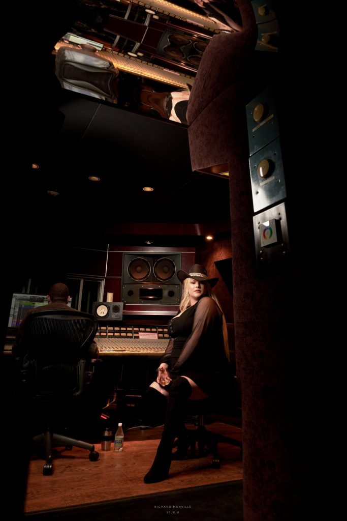
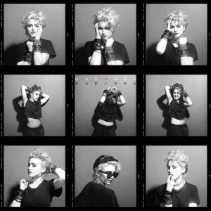
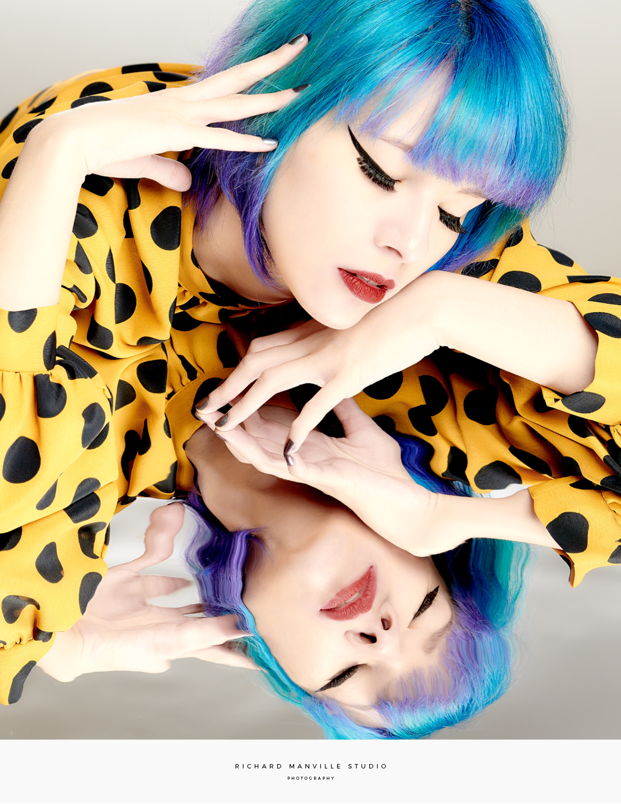
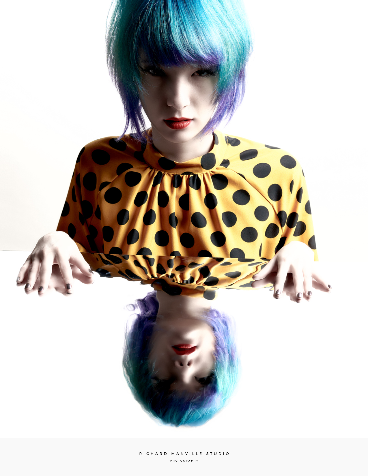
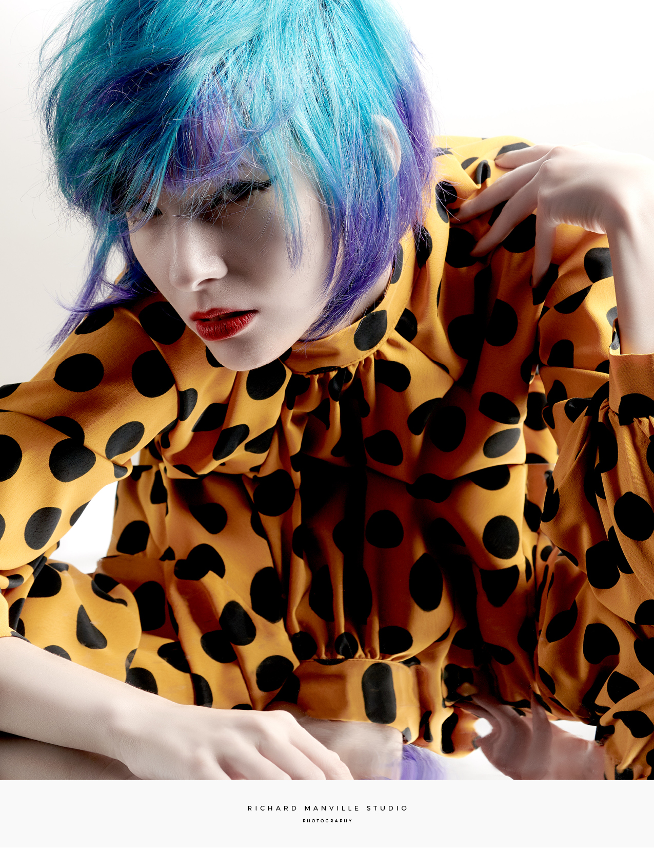
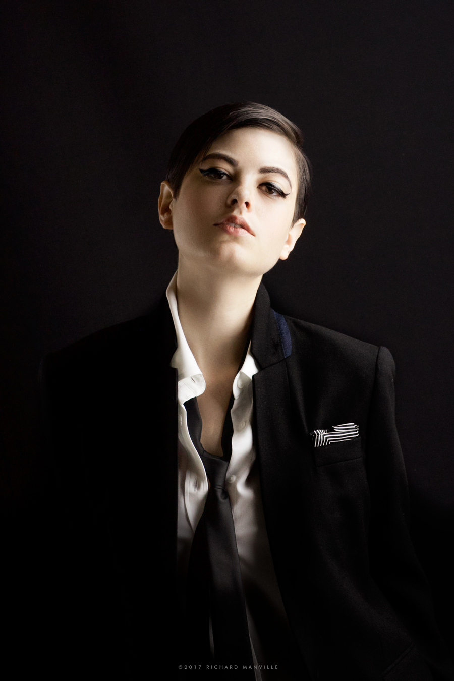
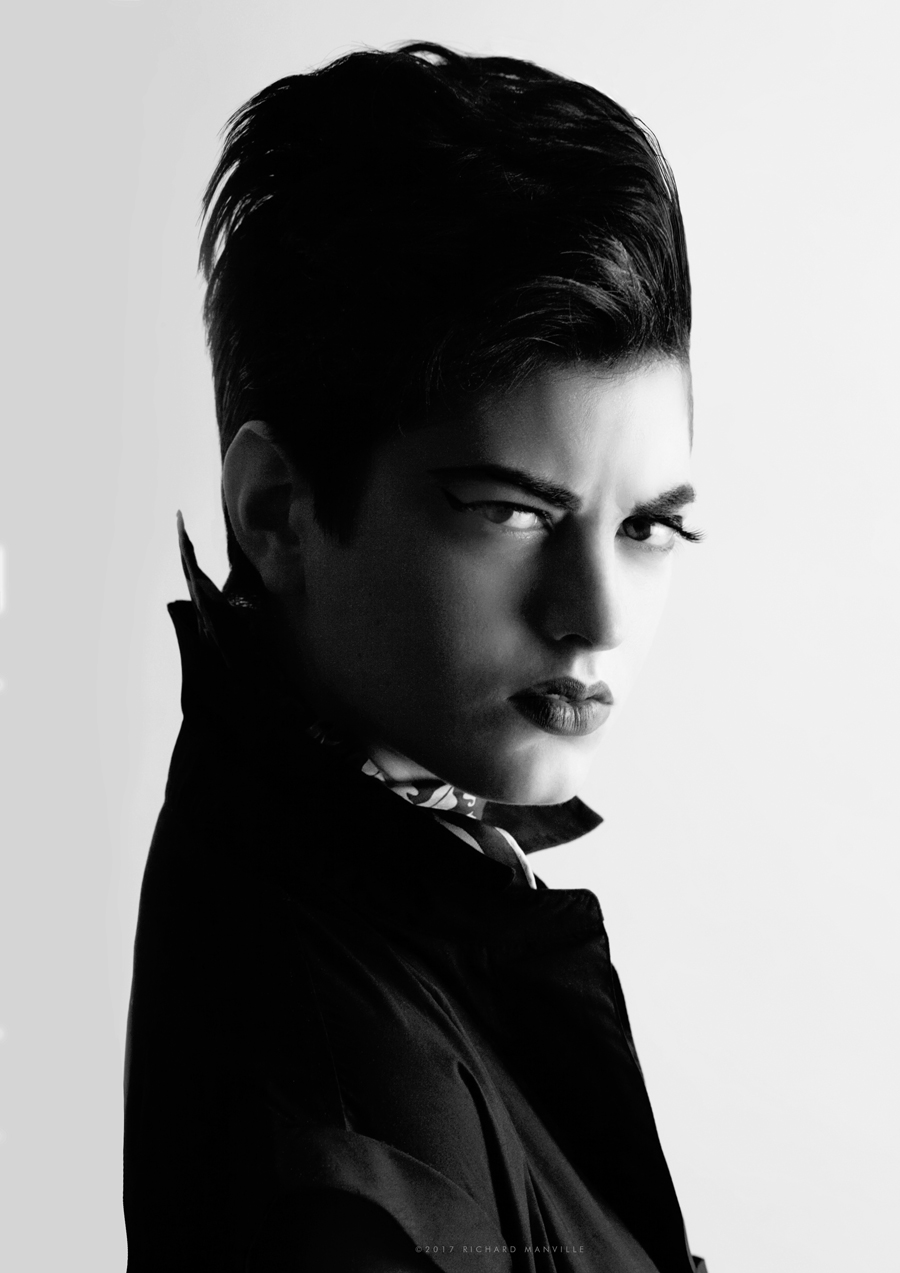
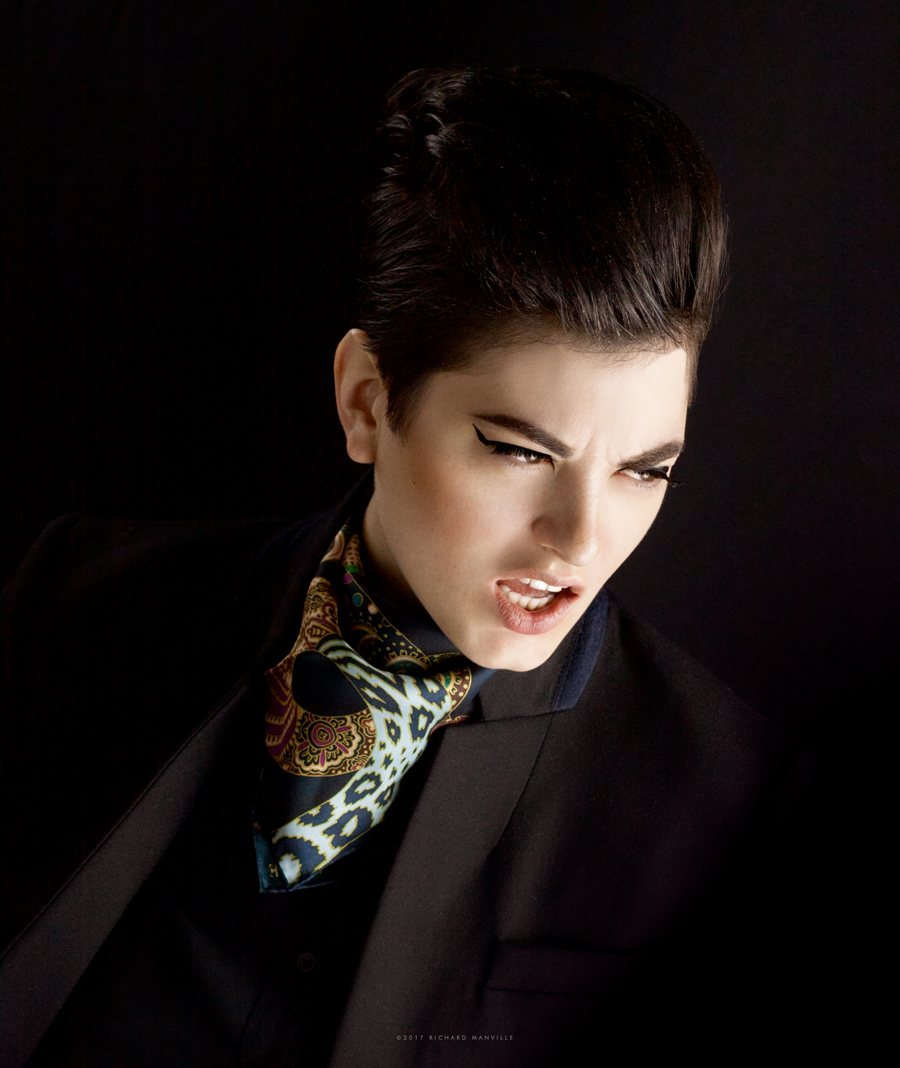
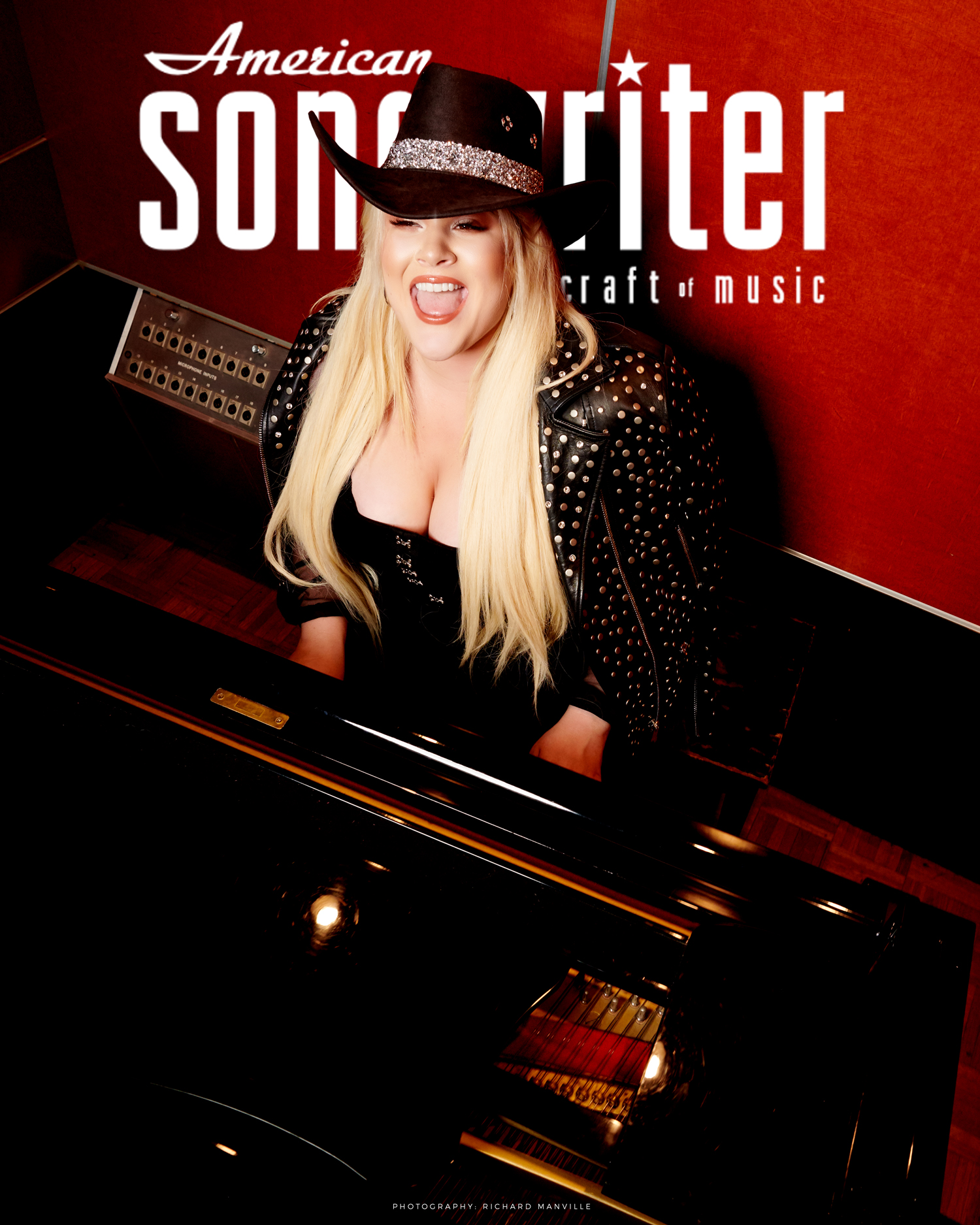
This is Royse. I had the pleasure to photograph this talented artist in the recording studio while recording her newest single “Ride The Bull”. She, her song, and my photo are featured in American Songwriter Magazine. Check it out here. ASM describes her single as like the edgier, older, doo-wop-less version of Meghan Trainor’s “All That Bass”. Go listen/download/add to your playlists.

Check out Royse’s instagram here


Share

Facebook Google+ Twitter Pinterest Email

Photography • Cover Art

April 17, 2020

I’ve had the joy of many collaborations while in the process of creating new portfolios in photography. Primarily collaborations with models and musicians who are in the process of crafting their own personas and careers.

One such collaboration was with songwriter, musician, producer Aaron Ficchi. I photographed him for the cover of his single Beverly Drive (below). The song has a very moody/sexy vibe, not unlike himself. So, the focus really only needed to be on his persona with few, if any distractions.

No accessories, no props, and well …no clothes. The simplicity allowed some key attributes to shine through; a sense of vulnerability, a timelessness (sans fashion) that not only worked with the slightly retro quality of the song but, hopefully, make it a lasting image.

RM.

http://www.richardmanville.com/wp-content/uploads/2020/04/ad480e71-d8f7-4f31-bdeb-30830427bc87.mp4


Check out the single on Spotify.


In other news, check out…

Rolling Stones Cover that never was by Man Ray

this article by Sean O’Hagan on The Photographers Who Revolutionized Album Art.

Photography by George Holz 1983

and this account of creating Madonna’s debut album cover from Carin Goldberg you might enjoy… The Making of Madonna’s First Album Cover


Share

Facebook Google+ Twitter Pinterest Email

The Cost of Branding

September 3, 2019

The world of design somehow manages to remain somewhat elusive to many. Both omnipresent and invisible. It is even scary if you find yourself having to need to hire a designer/firm to help define your brand. Where do you start?

This Forbes article is a helpful start.

forbes.com/how-much-does-branding-cost


Share

Facebook Google+ Twitter Pinterest Email

THE M COVERs

December 12, 2018

Photography has been becoming more of a focus for me recently. One of my favorite pastimes as a student at Parsons was spending hours looking at bound volumes of Vogue and Harper’s Bazaar magazines from the 40’s, 50’s, and 60’s. I developed a great affection for the aesthetic of the magazine cover. Something about the combination of my favorite things…fashion, art, photography, typography, and logo design… all together in one image just feels right. Unlike many photographers, as a designer and creative director, it’s impossible not to see a photograph in a context of some kind that includes typography.

When considering presentation of my own photography, I couldn’t resist showing it in the format I love. A magazine cover. My “magazine”, “M” (initial for Manville, of course), is in the form of a large card. Each image will make an appearance via social media with related content and/or delivered by good ol’ mail …like real magazines.


Photography: Richard Manville


Share

Facebook Google+ Twitter Pinterest Email

Photo Session: Blue

November 30, 2018

Photography, Styling: Richard Manville
Model: Simone Miller

I scheduled a session with raven-haired artist/model Simone Miller to do a photoshoot and as we began discussing the details of the shoot (concept, scheduling, etc) she mentioned …btw “my hair is blue now.”  My original concept was to shoot in a graphic black and white style, so needless to say, I wasn’t planning on blue hair. However, like most inspired creative projects, the unexpected can be a great gift. Given the opportunity of blue hair, I added a few sessions that would feature or highlight the blue.

 
Still graphic and clean, we took the color just a bit further with a Yayoi Kusama inspired styling.

I was pleased with the end result and left with yet another confirmation to always stay flexible and nimble in every creative process.
More selected images of Simone
Check out the Photography site

Share

Facebook Google+ Twitter Pinterest Email

Accents of France • Brand Renovation

May 28, 2017

Project: Rebranding
Client: Accents of France, Los Angeles/Paris
Service Provided: Consultation, Art Direction, Graphic Design, Typography, Illustration, Editorial Design, Branding
Accents of France designs, manufactures and installs custom decorative treillage, inspired by 18th century French Architecture. Based in the United States, Accents of France occasionally works in collaboration with Tricotel, a long time partner in France.
Their clients include renowned architects and designers from around the world. They also have a portfolio of many unique and prestigious projects.
Accents of France came to me to help create a hard-bound portfolio book/brochure, featuring their work.
The book would naturally need to compliment and reflect the sophistication of their work and clientele.
Upon review of all their previous collateral, it was immediately apparent that if we wanted the book to give the proper impression, we would need to renovate their existing brand identity.
Their logo, as a heavily featured element of the book, would need to be redesigned.
The original logo included, as does the current version, a calligraphic font and an illustration of an 18th century pavilion/arch.
The calligraphy was completely redesigned with greater sensitivity to traditional calligraphic spacing and more graceful and proprietary form.
The original pavilion icon was a beautiful 18th century etching, most often used at a very small size. The intricate treillage detail, when used at a small size, would bleed into a solid mass, obliterating the very thing they wanted to promote. Treillage.
To be sure the treillage detail would be visible, we re-illustrated the image in a more graphic style icon that would maintain detail and still be visible when used small.
This project was about refinement, restraint and spacing. These kinds of changes are some of the most powerful and challenging in graphic design. The changes completely shift and upgrade the feel and look of a brand without loosing the essence of the company’s core identity.
To see more of the book project that lead all these changes, check it out here.


We’ve designed and consulted for many clients on rebrands large and small.

One of our more advanced brand reconstruction projects in the luxury sector was for Agraria San Francisco including branding, product, print and web/digital. See what we did here.

Other brand exploration you may like was for Pleiades House in NYC. You can see that here.

Also, check out one of our more web-focused rebrands for Evite.

Accents of France’s website was redesigned using our elements but, although not designed by us, Accents of France does such amazing work it is worth checking out.

Share

Facebook Google+ Twitter Pinterest Email

Shooting Katy

May 25, 2017


Being based in Hollywood has its advantages.

This town is filled with beautiful people and if you’re lucky you get to work with people as lovely inside as out. Among the lovely ones, Katy Erin is a young actress and model that I had the opportunity to photograph in studio.

I asked Katy to sit for me to experiment with a series of images that would play with gender style featuring R.B.Manville silk pocket squares. Katy’s naturally impish androgynous qualities were perfect for the range of looks I was going for.


We had limited time (just a few hours) to attempt as many looks as we could squeeze in. So we started with the more boyish looks first and then makeup artist Perla Lizarraga progressively added shades of femininity with makeup and hair along the way; from School boy style to Jazz-age androgyny to a new wave-ish pompadour.


So, the reason for this shoot was to experiment with imagery for R.B.Manville.

R.B.Manville is a collection of silk squares primarily marketed as men’s pocket squares. The creation of R.B.Manville as a concept, was intended to be a collection of gift-able art/fashion pieces featuring  original print designs created by the studio.

The brand was launched during the height of a bespoke dandy movement in men’s fashion. The collection was intended to fit into a very select niche of the fashion/design connoisseur. Although primarily marketed as a men’s accessory, the brand’s venturesome style had received more attention and appreciation from not only a sophisticated male buyer, but a fashion forward female audience. We believe it has been mostly women buying for men. However another relevant trend of menswear for women was emerging at the same time.

The imagery for the brand, at its inception, was more neutrally product focused. As I began to think of the next phase, taking a more fashionable approach to the photography was a natural progression but felt that featuring men in pocket squares was a bit too “on-the-nose”. Social media has also created a big demand for more brand imagery and has forced many brands to be more visually prolific. So experimenting was well worth the time and lots of fun. I was really happy with the result and grateful to Katy and Perla’s contributions and beautiful collaboration.

Share

Facebook Google+ Twitter Pinterest Email

House in House

August 19, 2016


Shuffling through the archive, I came across this shot from an article in Veranda magazine a couple of years ago. Because I don’t really have a “press page” or show promotional tear sheets of any kind, this seems the right venue to share the photo above. The featured room was designed by Charlotte Moss and in the center of the photograph is the potpourri box I designed for Agraria. See the full series of boxes here.

Share

Facebook Google+ Twitter Pinterest Email

Ensemble Chemistry 1

August 19, 2016

This image is the first of a series called Ensemble Chemistry I created for the R.B.MANVILLE blog. These style boards were intended to put the product in an editorial context that might inspire a customer to incorporate the product into their own wardrobe. It’s always important to show how to wear certain products. Especially an item like a pocket square who’s soul purpose is to mix with other pieces in exciting ways. Mixing prints can be a terrifying act for many people. These style boards hopefully provide some fashionable peace of mind!

The following copy is as it appears on the blog:

No matter how much of a “star” a pocket square can be, (…and we are understandably a bit biased on this point) we have to admit a square is most often playing a supporting role in an ensemble cast of equally talented and extraordinary pieces. Finding the right balance of strengths is completely worth the effort when your result is a classic sartorial blockbuster.

We decided to put a few ensembles together, in the form of style boards for some visual reference. Our mission: see how some of our favorite squares perform in a group. We also wanted to give an idea of how well our squares might integrate into a wardrobe.

Most of our squares feature a variety of colors. This can make it easier to find visual relationships with other pieces or inspire combinations. Classic pieces, dressy, casual, modern, vintage… its all good. It is all about the mix.

So, mix it up. With multiple folding possibilities, colors and prints we’re sure our squares will bring enough “it factor” to create perfect fashion chemistry!

Check out the blog here.

Share

Facebook Google+ Twitter Pinterest Email
  • 1
  • 2
  • 3
  • 4
  • Older

About the studio

Richard Manville Studio is a Creative Branding Consultancy working with clients on brand development, through a blend of creative and strategic vision. Across our range of capabilities from brand work to product, package design, and photography, we explore the best ways to creatively maximize your business.

connect

  • Instagram
  • LinkedIn
  • Pinterest

Studio Services

Art Direction
Brand Strategy and Design
Concept Development
Identity Design
Interior Design
Photography
Palette Selection
Illustration
Information Graphics
Print and Publishing Design
Product Design
Packaging Design
Photo Styling
Web Design

welcome

The primary function of this site is as a means to exemplify my work as a designer, artist, photographer, and creative director.

As a guest, it is important to note that the text, images, data, and other content on this site are protected by copyright and/or patent protections owned by Richard Manville and/or third parties.

The site, and all the materials contained therein, may not be downloaded or used in any way without obtaining explicit written permission from Richard Manville and/or other relevant rights holders. Thank you for visiting!

Copyright 2025 RICHARD MANVILLE STUDIO